

Pantone colour of the year: Tips on using peach fuzz in your decor
Blog 26
In a world where design and emotion converge, Pantone’s colour of the year, Peach Fuzz, emerges as a beacon of tranquillity and versatility. This gentle hue encapsulates a serene essence, beckoning us to seek comfort and foster connections within our spaces. Its soft, warm tones evoke a sense of tenderness, resonating with our collective longing for solace and community.
Peach Fuzz’s versatility in various design contexts is undeniable. It seamlessly integrates into the interiors, offering a soothing backdrop that invites relaxation and calm. Its subtlety allows for diverse applications, from accent pieces to more prominent design elements, complementing different aesthetics and styles.
However, while Peach Fuzz embodies grace and harmony, confining it as the sole colour of the year might inadvertently limit the spectrum of available palettes. Design preferences vary widely, and embracing a singular hue could overshadow the richness found in diverse colour combinations that cater to different tastes and design contexts.
Despite its aesthetic allure, Peach Fuzz’s relevance extends beyond design, especially during global turmoil. While it doesn’t directly address conflicts or humanitarian crises, its promotion of human connection remains pertinent. By infusing warmth and empathy into our home interiors, this colour choice fosters an environment of understanding and comfort amid our tumultuous world.
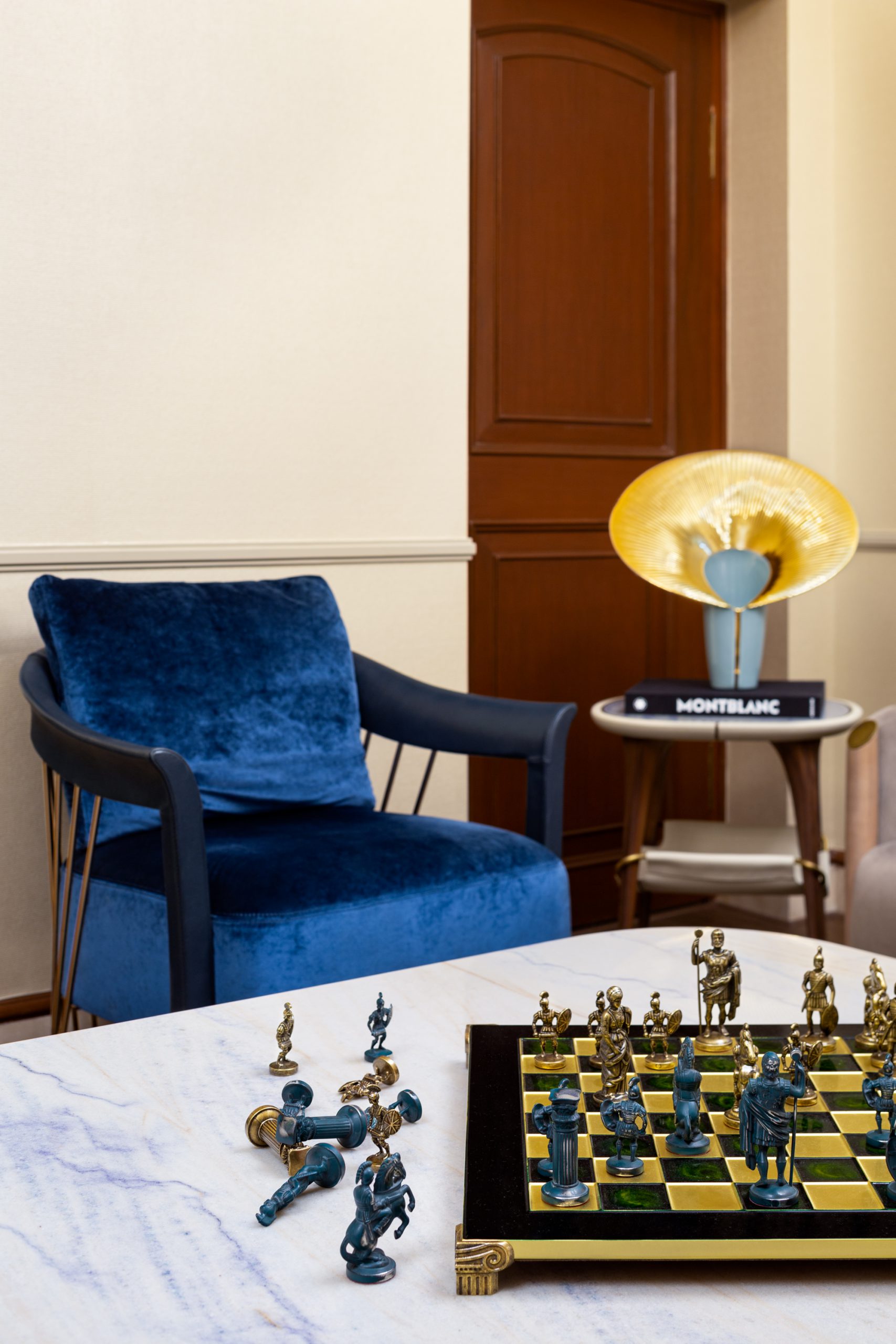
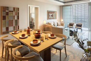
Peach Fuzz, reminiscent of Farrow & Ball’s ‘Smoked Trout,’ evokes a classic British ambience akin to ‘Downton Abbey’—ideal for rooms adorned with polished mahogany furniture and gilded art, exuding timeless sophistication. Yet, irrespective of one’s affinity for peach, its essence exudes warmth and cosiness, fostering a comforting ambience. This hue signals an embrace of warm colour palettes, cultivating interiors that cocoon inhabitants comfortably.
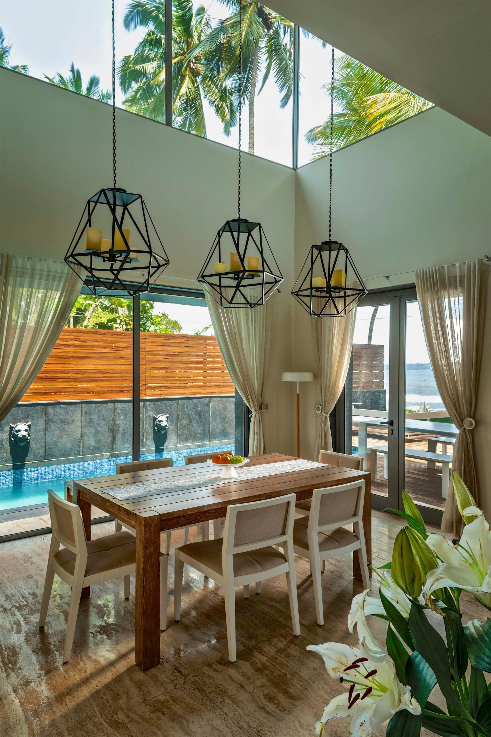
Especially suitable for spaces with limited natural light, peach infuses rooms with a radiant glow independent of daylight levels. Consider using it on dining room walls to impart a soft, inviting ambience, particularly in spaces with minimal fabric.
Pairing well with terracotta, a lighter iteration of peach, this colour scheme shines in spaces like sunrooms. A sense of warmth permeates by employing peach-toned walls, even in winter, seamlessly melding with terracotta-tiled floors, ensuring a snug atmosphere year-round.
As a trendsetter in the design world, Pantone possesses influence beyond mere aesthetics. While its primary focus is colour trends, it has the potential to reflect societal values subtly. Though not obligated, symbolically advocating for human rights through their colour selections could spark essential conversations and promote inclusivity.
Hues representing resilience, unity, or environmental consciousness could resonate universally in contemplating a more befitting colour of the year. Deep azure blues for resilience, vibrant greens for sustainability, or unifying shades of gold embodying hope might offer broader relevance, reflecting the multifaceted essence of our world beyond mere aesthetics.